What if the Jets never relocated, and used this style for themselves? It was an interesting concept I had to explore. Without the connection to Arizona’s Hopi tribe and their Kachina art through relocation, I can’t imagine this style would have ever crossed anyone’s mind. On top of that, the moose mascot only came into existence in Winnipeg because the Jets did leave for Phoenix. Setting logic aside, however, this is still a really fun concept that I just had to try out.


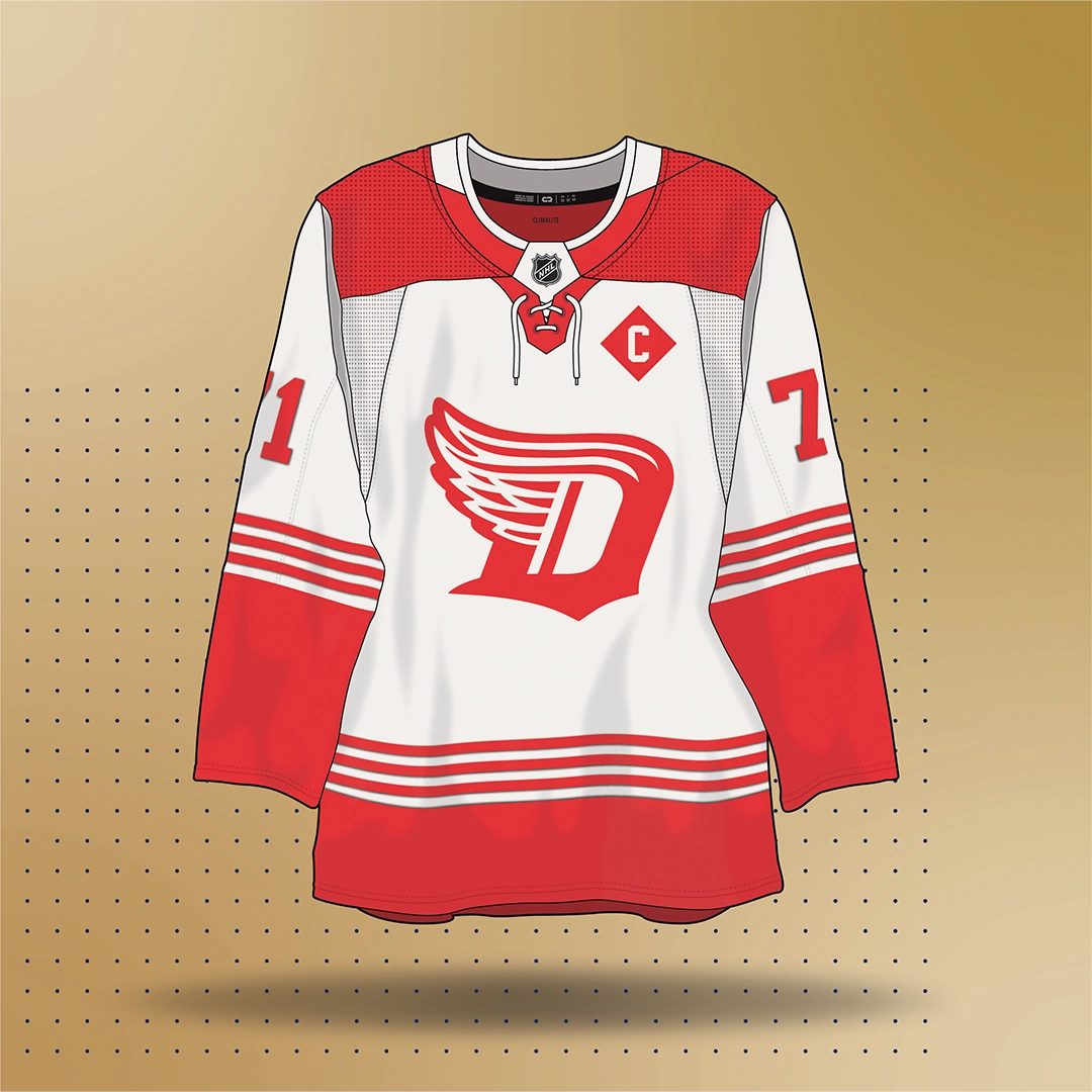
Attempting to redesign an Original 6 team is a daunting task. Combining the flying wheel and the retro D into a single, cohesive logo. Keep it retro, but with a modern twist.

Why does only Anaheim get rad mascot jerseys. Let Mick-E fly. I would love to see this design implemented as a third jersey, or warm up set. Could bring some much needed personality to the league.

Re-imagining the Kraken franchise if they decided to go with a different name. Felt like Sasquatch was a great option. Keeping it dark and mysterious with a touch of green for the wilderness seemed like good fit for the area.


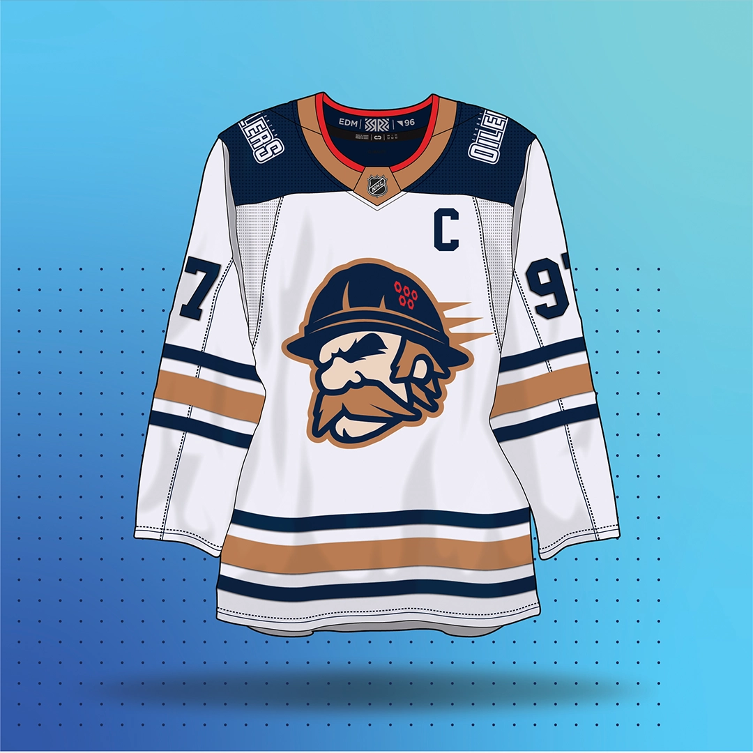
Back in 1996, the Oilers had the rig worker on their shoulder patch. I’ve always thought it would be cool to have that dude reimagined as a primary crest on one of their jerseys.